
Ever since I became aware of Color Collective (the blog that explores color by pulling out samples from photographs of well designed spaces, clothes, etc) via Design Sponge, I've been a little preoccupied with thoughts of color. Not only is Color Collective a brilliant idea for a blog, but it has me thinking a lot about the treasure of color in photographs hidden in plain sight.


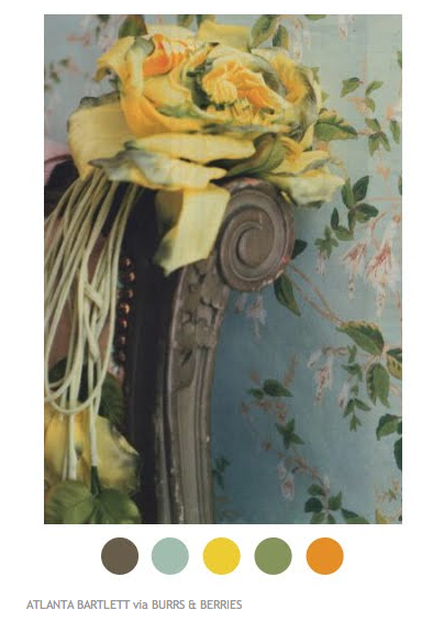
 The above photos are taken directly from Color Collective and do not belong to me.
A while back I remember thinking how surprising it is sometimes to sample color from a photograph I'm working on in Photoshop and realize, once I've isolated it, that it's not the color I thought it would be. So much about a photograph informs us about the colors we see in it other than the visual information available. Conceptually our interpretation of color is greatly influenced by the objects in photo and our expectations of what colors those objects are likely to be. Sometimes the time of day the photo was taken, or it's location, or even a idiosyncratic association we might have with it's subject can all influence what we think we are seeing. On top of all of this conceptual complexity, visually we can be misled by tones and hues in the rest of the photo which can make a single color seem more warm or cool, more muddy or more clear.
The following experiment helps to illustrate my point. I chose three points on the photo below as my focus. First, I estimated the color I thought was represented in each spot based solely on my naked eye and conceptual perceptions. Then, I used my eye dropper tool in Photoshop to take a sampling of the actual color in each of those spots. The result was a classic example of how our minds can skew the reality of what they eye sees.
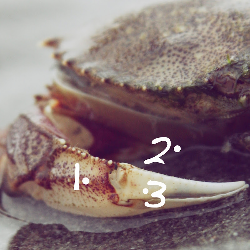

The colors I thought I was seeing were cleaner, clearer and more befitting the subject matter. The red in the crab was a truer red in my mind, but ended up with a decidedly plum hue. I was way off on the dark shadow color, thinking it was more blue than violet. And the yellow in crabby's claw I would have bet money was a much buttery, cleaner hue. And I was the one to edit this photo!! I know where my lines tend to swerve in curves, which hues call to over and over again. But, to my mind, crab red is red, not plum. Shadows are cold and bluish. Yellow, compared with the rest of the colors in this palette just felt so much warmer than what it really was.
Such is the fascination I've had with color lately. I find myself sampling from photos at random, just to see what I'll get. Below is the result of just such activity. It was pretty fun to pull out the colors that I particularly liked or ones that surprised me. It even lends something to the photos in a way too. Sort of a deconstruction and reconstruction at the same time.


1 comment:
very cool!! thanks for your kind words-- I love your experiments!!
Post a Comment